Saturday 27 April 2013

I can see what you had for breakfast!

Crafty Individuals have just bought out some gorgeous new stamps! One of them is this very useful and delicate flower stamp:-


I painted a chipboard heart with pink and turquoise paint with crackle around the edge which I emphasized with copper Inka Gold and stamped the flowers in the centre. I used my Tesco Sultana Bran cereal cardboard to die cut some flowers. Now I know recyling cardboard is quite normal but I had intended to paint it on the plain side! I realized, however, that it was actually white, pink, and turquoise, with text sections and I thought it was perfect just as it was! As long as you don't mind knowing the nutritional and calorie composition of my breakfast! I quite like the effect because the outside cardboard is very shiny. For the leaves I just used plain white card which I painted in two shades of green and stamped with a Crafty Individuals' script stamp.

Over on the Crafty Individuals' blog you still have time to enter this month's challenge, the theme of which is Spring Fashion, as chosen by Gio. You could win this new stamp, or any stamp of your choice! You also get a code to get 25% off your order just for entering. So go ahead, all you need to do is use one Crafty Individuals' stamp in your entry.

Wednesday 24 April 2013

It's Such a Perfect Day!


Over on the Happy Daze blog I have made this little hessian ('burlap' if you are in the US!) canvas. I have Brenda to thank for this as I had said to her when we were going to Ally Pally, please will you look out for hessian canvases like the Tim Holtz ones for me, and she said, don't buy them, cover chipboard with hessian and make your own! So I had a look on e bay and found hessian very cheaply and it makes such a textured piece. I didn't need staples, I just used glue. Thank you so much, Brenda!

I used the wrinkle free distress technique with peacock feathers, picked raspberry, and squeezed lemonade, and removed some of the colour from the little girl's face with bleach. I used the Artistic Outpost sets Lovely Day, and the ornate header from Whimsical Melange, overlaid on a pediment from the new Tim die. I am entering this into the Artistic Outpost Referral Programme for April. You can get their stamps from them if you are in the US, and from Happy Daze in the UK.

Monday 22 April 2013

Paperboy Triptych

I wanted to do a bigger project with the glorious Paperboy plate by Artistic Outpost which Terry so kindly gifted to me and this took ages and I am still not completely happy with it, but I think if I keep going I will just make more of a mess by throwing more things on! I am pleased with the background though, which you can see more clearly in the shot from behind:-


I used arch dies by Go Kreate which have three concentric shapes which are pretty large, and I used the biggest one in the middle. I used white card, painted it black, then embossed it with a large Cuttlebug cogs folder, rubbed it with copper Inka Gold and then with Patina gilding wax by Creative Expressions which is lovely, and then the Ranger Patina set, and buffed the whole thing with a soft cloth. I used grungeboard hinges from the Elements pack and gave them the same treatment.
 
 
The pointy bits at the top of the arches are from the Whimsical Melange set and the bicycle is from Lovely Day as I thought it might help with delivering newspapers but I am probably historically way out. The cogs are all cut from shrink plastic using the Tim Holtz dies and shrunk with Distress Embossing powder. The pencils, the word 'News', and the shrink plastic typewriter are all from Secretary Pool. All the images have been coloured with Distress Inks and stamped with a mixture of black, sepia, russet, and coffee Archival. I added a piece of Tim Holtz film strip over the girls' faces and curled the end. I dotted some copper cog 'sequins' all over the background but they were a bit bright so I darkened them a bit.
 
For the central arch I cut a frame for the 'You are a Hero' wording using sticky backed canvas and stamped it with the background text in a mixture of Archival inks as before. I splatted some water over the text and shredded the edges of the canvas a little and darkened the edges. I then finished off with a clock, cog, and spinner, to which I have added a bit of the patina treatment.
 
I showed this to Terry in advance and I said that, where I think I struggled with this is that the arches are very large and it gave me three large areas to fill. I think it would have been easier to make something smaller and then overlap/layer the images more. It was fun to make though! I am entering this into the Artistic Outpost April referral programme.

Friday 19 April 2013

Spring Fashion Mannequin and Box for the Crafty Individuals' April Challenge


I decorated this papier mache mannequin for my DT sample for the Crafty Individuals' April challenge, the theme of which is Spring Fashion, as chosen by the very talented Gio. I painted it in Lilac and Blue tones and then stamped it with Script CI085 and Flowers CI206 and a selection of the 1920s ladies from the sets CI322/323. I then stamped dozens of flowers from CI206 onto Spring background paper and carefully cut them out and adhered them around the hem of the mannequin so they overlapped and formed a sort of frill. My dear friend, Jack, then stepped in as I felt it needed something more. An Easter bonnet, perhaps? Jack gave me just the thing! A little straw bonnet in just the right dimensions. I painted it pink and then covered it with more of the flowers. Perfick!

I also made this little box using the same lady, flower, and script stamps:-

Another photo of the mannequin:-


I do hope you will join in the challenge. There are five chances to win, and you can claim 25% of your Crafty Individuals' order just for taking part!

Wednesday 17 April 2013

Pride and Prejudice - Book Box for Happy Daze


Over on Happy Daze blog today I have decorated a papier mache book box to look like an old leather Jane Austen book, using the Artistic Outpost 'Jane's Countryside' set, and a charity shop copy of Pride and Prejudice.

And lots of gold embossing powder!


I am entering this into the Artistic Outpost April Referral Programme, You can get their stamps from them if you are in the US, or from Happy Daze if you are in the UK.

Tuesday 16 April 2013

Windowsill Herbs in Metal Pails - for Unruly Paper Arts

Over on Unruly Paper Arts it is their Metal issue this month and I have altered some metal pails which had contained hyacinth bulbs and turned them into windowsill pots for herbs:-

I won't put the whole tutorial on here but I have used Paper Artsy Fresco Finish Paints and shown Leandra's technique using their Crackly Tissue Paper where you paint the image from behind so that the stamped detail shows through on the front. The other great thing with the paints, of course, is that they 'take' so well on metal and other surfaces without a primer. I hope you will pop over to Unruly and see the full tutorial. This was such a fun project and the herbs are still sitting on my kitchen window sill even though I did the article a few weeks ago - although you will see the oregano is actually coriander!

Sunday 14 April 2013

Steampunk Crafty Individuals' 'Finnabair' Inspired Canvas


Over on Snazzys the Design Team are challenging us to make something inspired by Finnabair. Well, I have been massively influenced by Finn, although I haven't been fortunate enough to go on one of her workshops. I made this canvas board in her style, using a Crafty Individuals' image from their Miniatures book where she might have used one of her photographs. I adhered multiple items, mesh, and stencilled embossing paste for texture before applying gesso to the whole piece and then applying shimmer sprays. I then went back to the gesso for some white highlights. I hope you like it. It took a long time, going back and forth until I was happy with the effect and I found it very challenging.

Tomorrow I have something completely different over on Unruly Paper Arts for their Metal edition. It is a set of metal pails filled with herbs. I would love you to pop over for a peek.

Friday 12 April 2013

Doing the Splats, Helen Chilton-Style!

 
This week on the Paper Artsy blog it has been the turn of my favourite person ever, Helen Chilton, and I have been so inspired there haven't been enough hours in the day to do all the things I wanted. As it turned out, it took me all my time just doing the first project so the others will probably go into next week and future challenges. It was particularly lovely that it was Helen as we had had a good chat and I had watched her demo at the Craft Barn last Saturday. So here is my entry for this week's challenge.

Helen was doing 'Splatting' with Distress Stains on a wooden cube to make a memo block. This is the most seriously messy thing I have every tried, and believe me I am no stranger to mess! I had my  friend, Pauline, round to craft (and Yes, she loved the notebook and her other presents), and she is a clean crafter, and was also wearing a clean top - when she arrived! She was sitting a table width away from me but was not safe! I had a nice new Boden top on (I'm a bit vain, despite being messy). After a moment I realized I needed to make a bib out of kitchen towel and push my sleeves up. My arms looked like I had measles! Pauline got a direct hit! Such fun though! I had wondered before if Distress Stains were worth bothering with but the dabber tops do make this splatting fun possible. I nearly bought the Picked Raspberry at the Craft Barn - Helen, wish you had said this was coming up and I would have bought a few more!!


I was pleased though that I had some wooden blocks. Shameless showing off now, as my brother, John, who I totally adore, has been chosen to do Marks and Spencer's exhibit for the Chelsea Flower Show this year, and he is at the carpentry stage of construction at the moment so he said I could have as much as I wanted. So there will be lots of different sized wooden projects coming up! I have tried to stick as much as possible to Helen's design but I didn't have the Pierrot stamps (love 'em, though). I also couldn't think of any way to do the memo pin part, although I found the solution in The Range yesterday, after I had made and photographed this (cue another attempt and more wooden blocks next week .......).


One of the lovely things with the Paper Artsy challenges is we are becoming a little community of commenters and entrants now and Helen advised about the white pen and Kezzy advised about the wire. My hubby, Colin, had put me off at the beginning of the week as he said I had to drill holes so I gave up very early on, on the idea of having wire coming out of the top. I had thought you could just poke something in, and it seems you can. Men are trying not to make themselves redundant (he would never be, as I keep him just for cuteness).


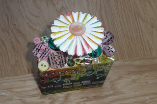
As you can see I stuck to Helen's design with the splats, the wooden block, the white pen, the rosette, and the stamped buttons. The whole button thing was fiddly. I pressed them down onto the inked stamps but they kept slipping away. Then it was surprisingly difficult to arrange them in a pleasing way.  I used some pearls to fill in odd gaps. Then I remembered I had a big bag of buttons but no idea where they were ..........


I struggled with the rosettes. I find it really difficult to flatten and glue them - am I alone? I added a little of the matching Distress Stain colours to tone everything in. I made four so I could decide what I wanted to do (I can use the others next week?). Bit annoyed with myself because I prepared the top one with a clock face and game spinner and it looked lovely and it was meant to go on top of the other one to add height, but the towering effect just wasn't right. So many things went wrong. So that is why it just has that quite plain button on the top, as that wasn't meant to be the top layer.


Some shots of the sides. I didn't really have enough Paper Artsy stamps to use although I hope to get some more at Ally Pally on Sunday. Yesterday I stamped some up at Brenda's (thank you so much, Brenda!), but I had already made this.


I'm not sure what I am going to use this for, since it is not a memo/photo holder like Helen's so it will probably go in the bin, but I really had such fun making it, and thank you so much for the inspiration and fun! Please Paper Artsy, bring her back regularly. A Helen is for Life, not just for Christmas!


Now are you still with me? Please humour me. Hope you will take this in the spirit of sisterly love. My gorgeous brother, John, and his lovely wife, Nic, have one of their garden designs featured in this month's (May issue) of Home and Garden magazine. I am not into gardening but it is a stunning project and the photography is breathtaking: it glows off the page. It is a glasshouse where the garden extends from the house into the outdoors. It talks about John (who has always been the loveliest brother any girl could have) and gives a very timely mention of the show. If you are in a newsagent and you are into gardening, which I know a lot of crafters are, or even out of loyalty to me, I hope you will take a peek at the article, which is called 'Enclosed Order'.

Wednesday 10 April 2013

It's Not Terry's, It's Mine!


My very dear friend, Terry, has bought me the most fabulous present for my 50th birthday! It's the Newsboy plate by Artistic Outpost and it arrived yesterday from the Funkie Junkie Boutique in the USA. She is so, so kind and I have inked it up already for this very quick make, which is a gift for her. I stamped the buildings in the background in different Sepia and Brown and Black tones, and then popped the Newsboy in the foreground. I stamped the word Extra! directly on the pen which goes with the notebook - perfect for writing down those crafty thoughts! The blue on the Newsboy's jumper was meant to be very subtle but I think it has come out more Man at C and A than 1900s Ragamuffin!

I am linking this up to the Artistic Outpost Referral Programme for April.

There has been much joking back and forth between Terry and myself about this stamp plate since it came out as she has been teasing me and tempting me with the gorgeous artwork she and the other  members of the Artistic Outpost DT such as my other friend, Alison, have been making and they did not have the plate at Happy Daze who I make items for so I couldn't get hold of it. Then she dropped me a line and said, 'I am getting it for you, for your birthday'. So now I can say, it's not Terry's, it's mine!*

Thank you so much, dear Terry, and watch this space for more projects, with the orphan Annie's .....

*(P.S. This expression may not mean anything in the US ...........)

You'Re JuSt My TyPE!


Over on the Happy Daze blog today I have made a card using the Secretary Pool plate by Artistic Outpost. I love their stamps (actually you may have noticed .......!) but I overlooked this set until my dear friend, Terry, started using them and she is such a temptress! Whenever she uses something I have to have it! Brenda offered to let me ink up her set but no, on this occasion I had to have my own as I knew I would reach for that alphabet block so many times. I was in a funky mood so I used some bright colours of Distress Ink like Picked Raspberry but this would also work well with vintage tones. I have to confess that I haven't actually stuck the words down on the card as I will probably change it into a birthday card, but it would be fun to give to a loved one.

I am entering this card into the Artistic Outpost Referral Programme for April. If you are in the US you can get their gorgeous rubber stamps direct from them here, but if you are in the UK you can get them from Happy Daze here.

Sunday 7 April 2013

Paper Artsy Vintage Sewing Themed Heart - and a Trip to the Craft Barn

 
Thank you so much for the kind comments on the notebook. I will give it to Pauline but I wasn't being disingenuous: it does have lots of flaws on it and I felt I stuck too much on it to try to cover them. Petra was recommending I just use ordinary fabric in future, with book binding glue, and that sounds like good advice. There is something quite special about the feel of a fabric covered notebook.

This week on the Paper Artsy blog, Michelle Webb has been back with some wonderful inspiration. Wish I could have met up with her when I was in Stockton the other week. Maybe next time.
Today I've made a folk heart for the Paper Artsy blog challenge, using Fresco Finish paints with a crackle layer in between and then a selection of their gorgeous vintage sewing related stamps, mainly from the Hot Picks range I think. When I gave Petra back all her stamps last week which she had kindly lent to me for some weeks, I stamped some up on tissue paper (I'm not daft!) so this is a collage of those images. I added some chipboard die cut buttons and a scissor charm for a bit of dimension. Petra and I are going to Ally Pally next Sunday and I am so excited that there are going to be some new Lynne Perella releases! I am hoping to buy a set I can lend to Petra to return the favours!


Leandra has been saying on the Paper Artsy blog that she is at the scrap show in Paris this week! Jealous? Us? No, because we went to the newly relocated Craft Barn yesterday and saw the lovely Helen Chilton demo-ing the new Sara Naumann, Lin Brown, and JoFY stamps from Paper Artsy, and had a great chat with her. This is what she was doing, and this is what she very kindly gave to me:-


I bought some more Fresco Finish colours (I know, how odd), and some wood and papier mache items to decorate. I also met Neil Walker for the first time and watched him demo - Hello Neil! And Petra and I have booked in for an Andy Skinner workshop, which is my birthday present from Col.

Friday 5 April 2013

Beautiful For Something - Pride and Prejudice Notebook


This make turned out to be much more problematic than I thought! How often do I say that! I wanted to make a notebook for my dear friend, Pauline's, birthday, as she carries around with her a notebook I decorated for her many years ago which she takes to shows with a list of what colours of Pro Markers she has, etc, in it. I had in mind to cover it with some adhesive fabric I had bought a while ago which I thought would make it quite textured but it turned out to be not very sticky, and to be quite stiff to work with. I wanted it to have an interesting 'feel' to it, without having too many bits stuck on that might fall off when it gets pulled in and out of her bag. I also found the fabric didn't take ink or glue very well either. I almost pulled the fabric off and scrapped it, and I am not sure now whether to give it to her or not. I know she would be appreciative of any present I gave her, but her own work is always such perfection.

Anyway, that aside I wanted the design to incorporate butterflies, for the Country View Crafts Challenge, so I used some pieces from the Tim Holtz melange tissue wrap. I was desperate to ink up the gorgeous Mr Darcy stamps Pauline gave me for my birthday which also makes this a fitting entry for the Indigo Blu challenge, which is Words and Phrases. I used their Background Script stamp over the whole of the back and front of the notebook, as well as the Pride and Prejudice quote. I painted the design with Fresco Finish paints, using the colours of the fabric to dictate my colour choices. I wanted to join in the Artistic Stamper  challenge  which this month is Texture as the fabric makes the whole notebook feel very tactile in the hand (the only thing that stopped me ripping it off and replacing it with paper), but for extra texture I added the only thing in this make that I am happy with - the flowers. I glued little pieces of the fabric onto grungepaper and inked up the stamp and pressed them onto the areas where the flowers were and cut them out. IRL they look really textured and I added some touches of paint to them to make sure each flower had the right mix of blue and pink, and added Claret in the centres.

Here's the reverse of the notebook just to show the pretty fabric and its texture, and the text:-


To finish off, I glazed the focal image to bring out the colours.